Cushi Ming Wins Youth America’s Cup Contest
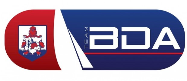
 Bermudian designer Cushi Ming [pictured] has won the competition to design the logo to be worn by members of the team representing the Island in the Red Bull Youth America’s Cup.
Team BDA will consist of athletes and sailors representing Bermuda against teams from around the world – all sailing the same boats, AC45s, used in the Louis Vuitton America’s Cup World Series last October.
Mr Ming, who runs Ming and Co which helps small businesses by overhauling their brand’s visual identity with world class design, said: “This is such an amazing opportunity both for the young people who will be selected and for us, as a community, get behind a Bermuda team which will be competing on a world stage.
“Of course, I am delighted to win and I am very proud to think that it will be my logo that will adorn the clothes of Bermudians representing Bermuda in Bermuda in such a prestigious event.”
He added: “For me as a designer and a proud Bermudian, it’s about doing my part to ensure that Bermuda is viewed on level terms with the rest of the world and a logo is arguably one of the most important parts of that equation.”
In the coming weeks, a selection committee plans to identify a squad comprising of the best sailors and athletes who, with intensive training and coaching, will be equipped to compete with the world’s best young sailors in foiling high performance catamarans.
Team BDA will train and race in the Great Sound before a hometown crowd as they face other youth teams from around the world in June 2017.
The Red Bull Youth America’s Cup began in 2013 when the America’s Cup was staged in San Francisco. It was won by the New Zealand Sailing Team – and two of the crew, Peter Burling and Blair Tuke, were later offered jobs at Emirates Team New Zealand.
Mr Ming’s winning design:
Jane Savage, chairperson of the Team Bermuda Red Bull Youth America’s Cup committee, said she was delighted with the response to the Bernews poll asking people to vote for their favourite logo.
“In addition to the winning logo, Mr Ming has designed several variations which our committee believes can also play a role, although to a much lesser extent.”
Mrs Savage added: “This logo contest shows some of the awesome opportunities available to our community beyond just the sailing competition.
2013 Red Bull Youth America’s Cup highlights
“This logo will be seen worldwide and we hope it is worn with pride by not just the team, but also members of the community as they support Team BDA.”
Mr Ming was rewarded with a prize package of America’s Cup-branded merchandise and a premium web advertising package on Bernews and affiliated websites.
If you want to keep up with what is happening with Team Bda follow them on their Facebook page.


Congratulations Cushi and thanks everyone for voting for the winning logo…(grumble..grumble..grumble…e’en though it’s missing some light blue!)
BLUE AND BLUE 4 LIIIIIIIIIIIIIIIIIIIIIIIIIIIIIFE!!
Year some light blue would have been s wicked touch.
use the light blue slant it just a bit as the sky horizon
Congratulations Cushi!!!
Well done Cush and best of luck to Team Bermuda!
Congratulations Cushi!!
Congratulations Cushi and best of luck Team Bermuda! Whoop Whoop!
Congratulations Mr. Ming. Wonderful to see some local Bermudian talent win this contest.
Hats off to everyone involved with creating this opportunity for a Bermudian to image our team.
Go team Bermuda!
Cool that is the one I picked. Well done.
Thanks everyone!
Hmmm…never saw this competition publicized for entries. Good design though. Congrats.
Congratulations Cushi! All the best to Team BDA!
Well done guy!! I’m not a fan of the design – but at least you’ll be able to take it easy for a bit now – you know with all the money you must of won… take a trip and see the world…
@cranberry…what a dumb comment..are you drunk?
I dont see how “TEAM” will scale well, when this whole thing is sized down for a shirt logo…
The gradients look cool for the web, but again… is this being used for a shirt?
Wonder if there is a simpler version for these uses. My guess is there must be?
No, the TEAM will not scale well at all and it is also too lightweight. And you’re right, the gradients would best be removed for shirts especially if it is embroidered. In hindsight, I think that not spelling out Bermuda is a mistake. With that font, the D could be mistaken for an O. For persons not knowing the Bermuda abbreviation nor crest, this reads Team BOA…a snake. For an image that would be seen worldwide, I hope there are changes made to it to make it work before putting it out there as final.
Well done God child I am so proud of you continue to aim high
keep God first Love You
Well done Cushi! You keep going from strength to strength. You should be very proud!
I am very proud of my former student.