Proposal For 40 Foot Long Bermuda Sign
The Corporation of Hamilton is seeking permission to install a 40 foot long ‘Bermuda’ sign on Front Street.
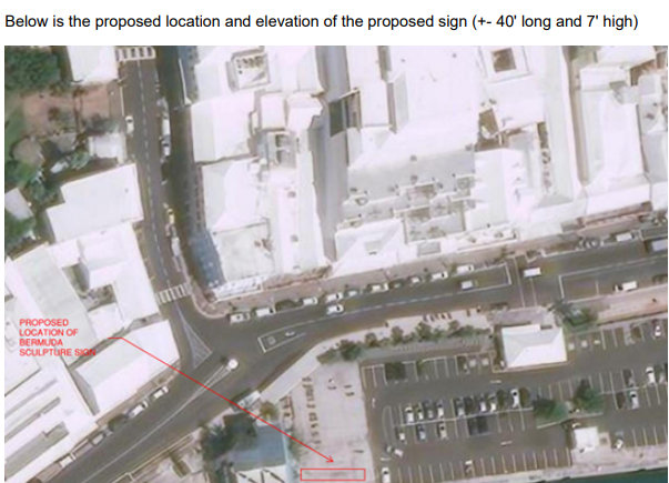
A section of the planning application said, “The proposal seeks planning permission for the installation of the Bermuda Marquee Sign on the existing cycle area that is level and concrete surfaced at No 1 Car Park immediately adjacent to the Bermuda Visitor Services Centre at 10 Front Street.
“The surrounding area is the ferry terminal to the west and the Historic Protection Area of comprising of retail shops on the ground floor of Front Street. The proposed marquee sign has a footprint of approximately 40’-0” x 2’-6” and is 5’-10” in overall height with Bermuda themed aluminum panels making up each letter.
“The proposed location offers the general public opportunities to photograph themselves at the marquee sign with views of Hamilton Harbour and White’s Island in the background which will enhance the amenity potential and public use of Hamilton’s waterfront as per the City of Hamilton’s Plan 2015 SSA.”


Maybe priority should be given to easing congestion, increase affordable parking options…
Can we not do two things at once?
Seriously? What do you think?
Can’t do that, the corporation has been spending hundreds of thousands to increase congestion with all the sidewalk modifications and removal of street side car and motorcycle parking bays.
Actually, I’m all for increased pedestrianisation of downtown Hamilton. If a few Bermudians have to waddle from Bulls Head to get their KFC, so be it.
It is utterly absurd that the finest real estate on the island – waterfront, Front St gold – is a parking lot and gated docks.
If the Government planners haven’t worked out they must be nuts (then again they are looking to ‘regenerate’ North Hamilton for the 12th time).
The waterfront belongs to the City of Hamilton, not the PLP Government … at least for now.
In true Bermuda fashion….they’re doing something that the rest of the world did 20 years ago. LMFAO
No real problem with a sign but the size is a bit overkill. Half that length would be enough.
Meh.
It will look really really nice after the first hurricane.
Tacky, cheesy, corny come to mind, very Cancun and Belize like. It’s a no for me.
Shouldn’t the sign go at the beginning of Front Street, nearer King Street or the John Swan building down there?
That makes no sense. CoH is trying to have this somewhere where tourists are more likely to be (ie around more shops and restaurants, the ferry terminal, the cruise ship dock). There aren’t any attractions near John Swan’s building.