
Bank Of Butterfield Unveils New Branding
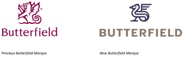
The Bank of N.T. Butterfield & Son Limited today unveiled an updated brand identity for all Butterfield Group companies, featuring a more “contemporary wyvern device and modernized wordmark.”
“The wyvern, a mythical sea dragon, which represents protection and valor, has been part of the Bank’s corporate identity for over 60 years, and has its origins in heraldry. A wyvern sits atop the coat of arms of the Butterfield family who established the Bank in Bermuda in 1858,” the company said.
“The Bank’s new corporate colors—deep blue and warm gray—are symbolic of sea and land, and reference the island locations where Butterfield has its major operations. The line work in the updated wyvern design is evocative of ocean waves. The colours and forms of the new marque form a distinctive identity that reflects Butterfield’s status as the world’s leading, independent offshore bank and trust company.”
Michael Collins, Butterfield’s Chairman and Chief Executive Officer commented, “The last few years have been a period of strategic growth and change for Butterfield. We have expanded our global footprint by establishing offices in Canada, Mauritius, Singapore and Jersey, and we now have operations in ten international locations.
“Following our public offering on the New York Stock Exchange in 2016, our shareholder base is now also global. We, therefore, felt the time was right for Butterfield to update our brand identity to reflect the Bank’s evolution and its unique place in the world of finance, while honoring our heritage as a 161-year old island bank.”
The new brand identity will be adopted by all Butterfield businesses in all markets. To minimize waste, the changeover from the previous marque will be phased in over several months.
Clients will begin to see the new brand identity on select marketing materials in the coming weeks, but the complete conversion of all Butterfield materials, signs and its online estate will extend well into 2020.

And yet Butterfield’s banking portals (both business and personal) still bear the old logo!
Make a u-turn quick. The old one looks so much better than the new. The new looks like something I made in primary school
New mini dragon ..
The old marque has class. The new one looks like something from primary school, even though it probably cost a lot of money to have it designed by ‘experts’.
I agree. Horrible!
That’s the stupidest thing I have ever seen. Looks like a dragon bird. Who did you pay to do this? How many senior management Yes Men pretended this looked good?